
Hotel Comparison App
Commercial AirBnb Redesign
1
2
3
4
5
Define
Analyze
Ideate
Design
Test & Refine
Challenge
I can't compare prices!
I can't compare hotels side by side.
Too many options.
I want to look at hotels before settling on dates.
A majority of users, comprising 73.75%, utilize hotel booking apps with the intention of checking and comparing prices; however, a prevalent issue arises as many of these users express frustration over their inability to conveniently assess and compare prices, often stemming from the limitation of not being able to view hotel prices without specifying specific dates or viewing different date options.
Solution
By implementing a meticulously designed and flexible customer journey flow spanning from initial search to final transaction, complete with a feature enabling users to directly compare properties and amenities, there will be a notable elevation in customer retention rates, heightened customer satisfaction, and an increase in purchase rates.
Process
As the sole designer throughout this 2-month project, I assumed full responsibility for the comprehensive end-to-end UX process, dedicating considerable effort to research in order to grasp and align with user objectives. My methodology for this endeavor encompassed a diligent progression through research, definition, analysis, ideation, design, and validation phases.
1
2
3
4
5
Define
Analyze
Ideate
Design
Test & Refine
73.79% of users utilize hotel booking apps with the intention of checking and comparing prices.
Competitive Analysis
Usability Tests Notes
Usability Test
Users unable to compare prices and find competitor apps have too much clutter and inconsistency.
Affinity Mapping
Customer Journey Map
Finding solutions for users wanting to compare prices, dates, and hotels with flexibility and ease.
User Flow
Sketching
Simplifying initial design of date selector comparison feature.
Sketching
Wireframe
Users walk through high-fidelity prototype and give insightful feedback.
Usability Tests
Annotated Eng Delivery
UI | Branding
Prototyping
Findings through Analysis

In analyzing the research from the usability tests, competitive benchmarking, a recurrent theme emerges: users express dissatisfaction stemming from their challenges in effectively comparing hotels and prices. Additionally, users encountered notable difficulties locating their reservations and voiced disappointment with the application's date selector, search results presentation, and room selection interfaces.
Ideation
Navigating through numerous iterations, the quest for a solution that embodied a minimalist aesthetic, avoiding user overwhelm, proved to be an iterative journey. The primary hurdle encountered was striking the right balance to prevent overcomplicating the new feature. However, by engaging in extensive ideation and sketching, I successfully arrived at a resolution harmoniously aligned with the existing design system.

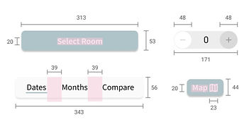
Design Kit
The design system integrates key Google elements, including the Google Font Noto Sans SC and the Materials System, resulting in a harmonious and consistent design approach that preserves its minimalist and contemporary essence. Complementing this, the chosen color palette of subdued greys and calming blues fosters a sense of tranquility, instilling users with confidence and trust in the application.
Typography
the quick brown fox jumps over a lazy dog
ABCDEFGHIJKLMNOPQRSTUVWXYZ
Noto Sans SC | Regular | 653 wt
Color Palette
#FFFFFF
White
#FAFAFA
Lightest Grey
#EDEDED
Light Grey
#B8B8B8
Medium Grey
#555454
Darkest Grey
50% opacity
#555454
Darkest Grey
#000000
Black
#7C919A
Dark Blue Grey
Icon Set
Buttons

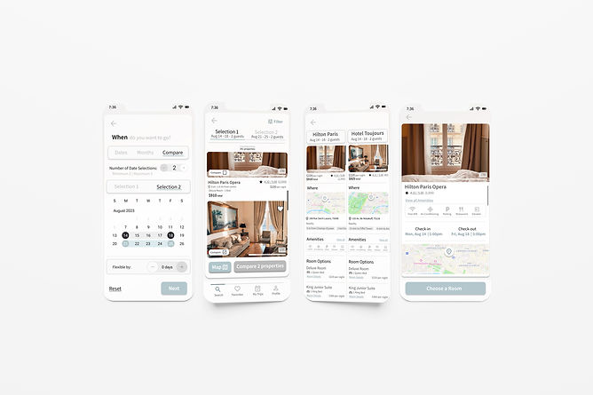
Original High-Fidelity Prototype
Usability Tests
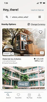
During two in-person usability tests conducted on the original high-fidelity prototype, valuable insights were gleaned as a participant engaged in completing two task flows, shedding light on user behavior, impressions of the app's design and information architecture. The test also provided a deeper understanding of the process and flow, particularly regarding the utilization of the compare date and compare properties features.
Impression
The light color scheme posed issues for the participant's eyesight. "I wasn't even aware that Selection 2 was there. It's too faded." Additionally, the lack of color contrast raised concerns about missing vital information, with comments such as "This is like part of my itinerary - That should stand out."
Overall Flow
In terms of overall flow, the participant expressed satisfaction, noting, "It flows really well. And I like the comparisons. I liked how efficient it was and how it flowed."
Comparison Feature
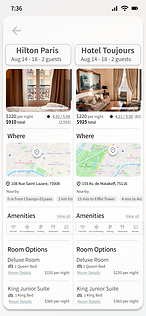
The participant found it user-friendly, remarking that "side by side is easy." Their overarching impression reflected positivity, stating, "Yeah, it's cool! I like that I can see all the details. Like I had two things I'm interested in, I could just do it quickly and efficiently."
Refined Design
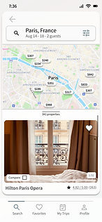
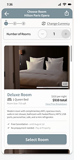
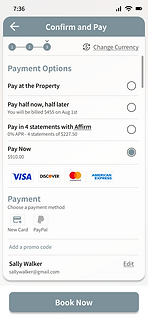
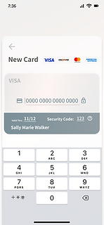
Following user research conducted on the previous high-fidelity prototype, it became evident that users were encountering challenges related to the overall impression of the application, prompting primary adjustments centered around enhancing text contrast and refining the visual hierarchy.
#AEC4C9
Blue Grey
#7C919A
Dark Blue Grey
#D9D9D9
Light Grey
#B8B8B8
Medium Grey
Final Results
View Interactive Prototype





.png)





.png)
.png)